brendongray-portfolio
Final Project Outline - Part I
High Level Summary
For my project, I want to highlight the consequences federal redlining policies have had on the current Pittsburgh housing market. I am particularly interested in demonstrating the salience of this issue for Pittsburgh residents.
Story Summary
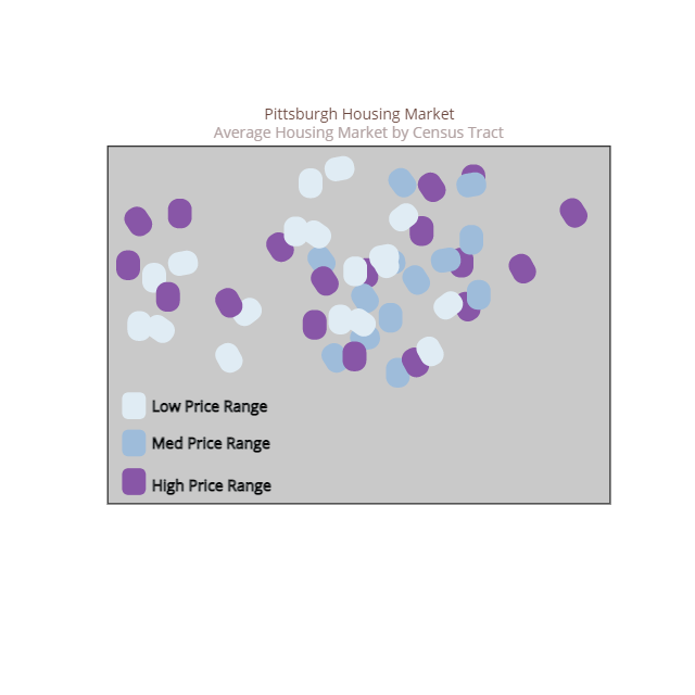
- Setup: The housing market in Pittsburgh has clusters of high-value homes and clusters of low-value homes.
- Conflict:
- Point one: In Pittsburgh, the federal government used lending policies in the 1930s and 1940s to systematic deny access to homeownership to non-white communities and especially Black communities.
- Point two: The consequences are still borne in the market today. More importantly, the effects on people today.
- Resolution: There are ways for you to find out ways you have benefitted from these policies in Pittsburgh. There are also local, state, and federal policies that can start to work against this denial of homeownership.
Initial Sketches
Header 1: The Pittsburgh housing market.
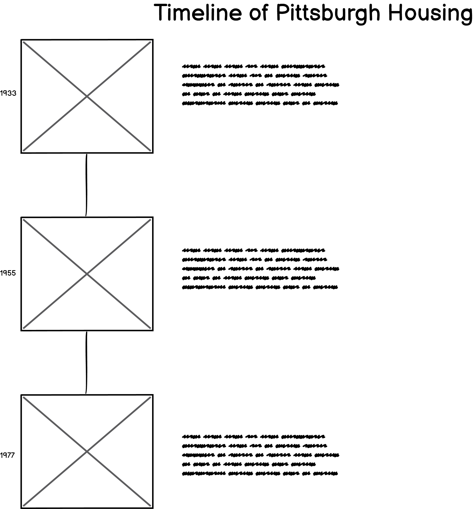
Header 2: History of Housing Policy
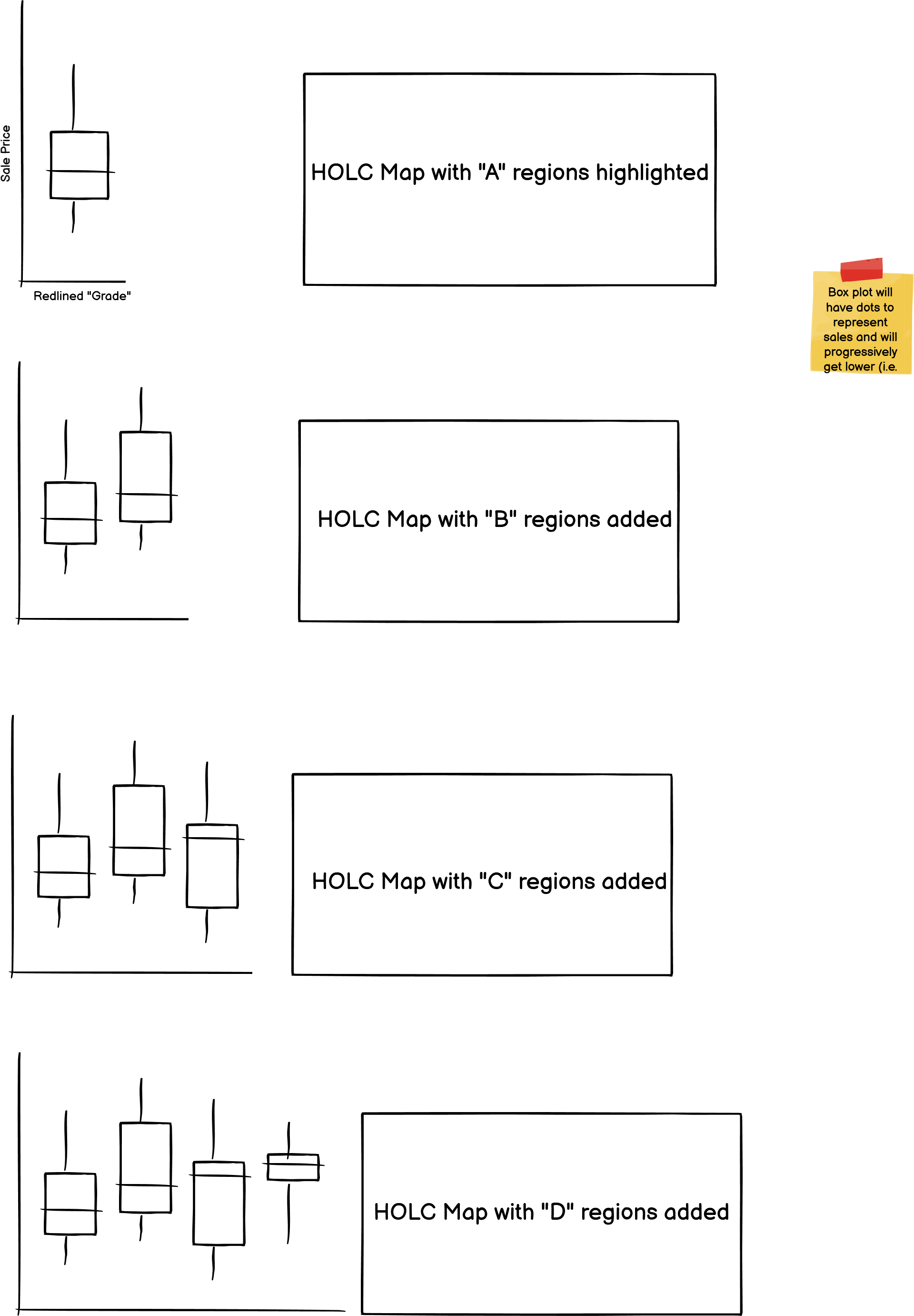
Header 3: HOLC Maps and their consequences.
.png)
Breakdown of differences across redlined grades.
The Data
The primary data for my project comes from two sources. First, redlining maps from the Home Owners’ Loan Corporation (HOLC) are available from the Mapping Inequality Project of the Digital Scholarship Lab at the University of Richmond. These maps have been geocoded and are downloadable directly from the website. These shapefiles have been widely used and are widely accessible.
Second, Pittsburgh property sales data is publically available from the Western Pennsylvania Regional Data Center (WPRDC). These data contain all property transactions since 2013. The benefit of this form of data is the granularity. The property sales can be linked to the redlined maps because each property has a geocoded location. This type of data is contrasted by other housing market data sources, like Zillow, which typically aggregate information at less granular geographies. I plan to spatially join the redlining maps and the property sales data using R (which is the only GIS platform I have experience working in).
Lastly, I will use the Zillow Home Value Index (ZHVI) for housing market value estimates across large geographies. For example, I will want to provide an average sale price for Pittsburgh at large. This information is best from a commercial sources like Zillow, because it estimates from the entire market, not just those properties with sales in the last 10 years. This will help round out the property sale data from the WPRDC and tell a more accurate, full story. I will not be linking the Zillow data with the redlining maps because there are geography level mismatches.
Once fully cleaned, I plan to use Tableau to build maps with various levels of granularity. For example, while I plan to display the property sales as individual geographic points, my primary visualizations will involve aggregating data to neighborhoods, Census tracts, or Census block groups. I have (limited) experience with this type of aggregation and manipulation using GIS packages in R.
Methods
I plan on using Shorthand to publicly present my story. While most of my data have a geospatial element, I have not chosen a mapping-making platform like ArcGIS Story Maps because I want the focus to be on the story, not the map. I do not have the capability nor experience to build out fully interactive maps. I would like the reader to draw conclusions primarily from the non-map features of the story, such as well-designed timelines and tables. The maps, while helpful, will be a highlight to these primary storytelling devices.
I will build most of my data visualizations in Tableau. This will include simple Tableau choropleth maps. I plan to create basic tables and graphic assets for the timeline in Canva.